dxw Accessibility Manual
Using colour to show information
Do not use colour as the only visual means of providing information. This excludes users with certain visual impairments, people who use text or braille displays and users with low-colour or monochrome displays.
Example #
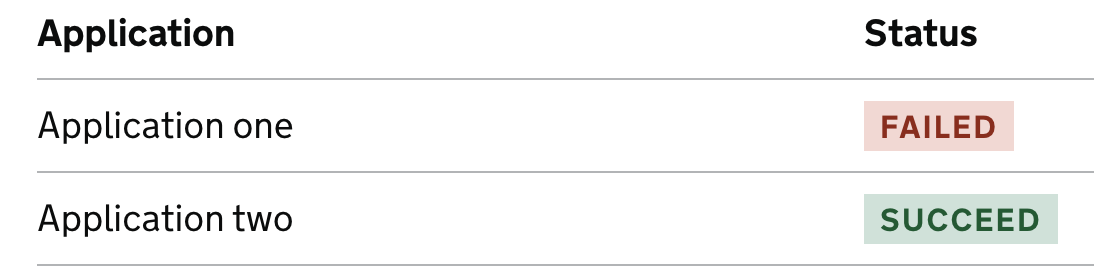
We want to show the outcome of a user’s application. This option does so only using colour.
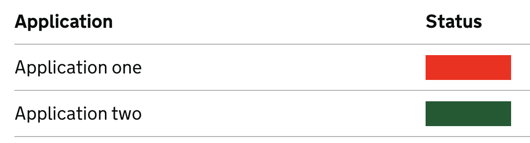
This is how this visual would appear to someone with protanopia, the most common form of colour blindness

You can use colour in your designs but you must add another way to signify meaning so that someone who cannot perceive colour can still understand the information.