dxw Accessibility Manual
Choosing accessible colour contrast
All colour combinations must have sufficient contrast.
- headings must have a colour contrast of at least 3:1
- body text must have a colour contrast of at least 4:5:1
- very high contrast, like pure black text on a white background, can be hard to read and cause eye strain
- avoid placing text over images or textured background - if you must place a solid or a transparent dark background behind the text (assuming the text is in white or other light colours)
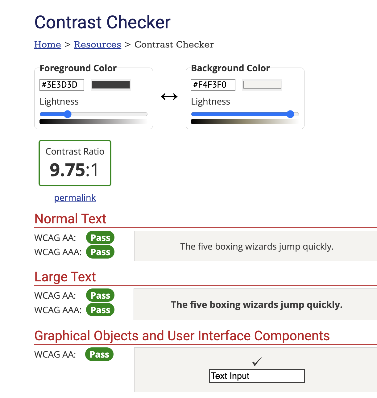
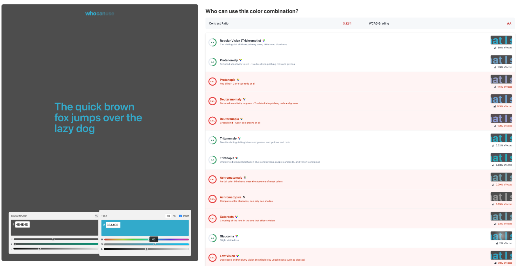
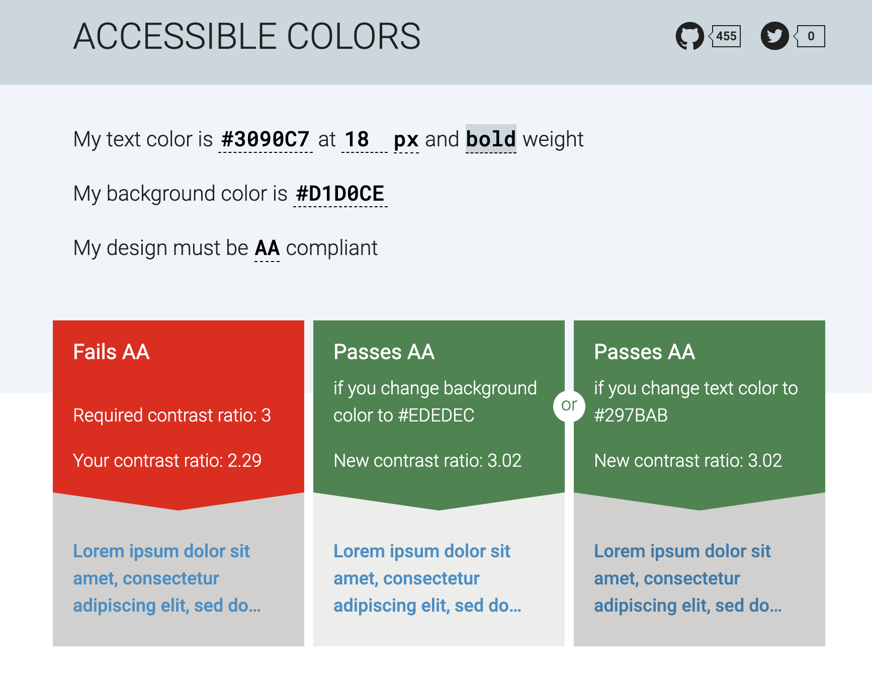
Use tools to check colour combinations
- WebAim’s contrast checker tells you if your combinations pass or fail the web content accessibility guidelines (WCAG) at AA and AAA
- Who can use shows how your combinations look to people with certain eye conditions and in certain light settings
- Accessible colours checks your contrasts and suggests alternate text or background colours that will pass WCAG AA and AAA